2017
Branding
Whiskey Cabinet


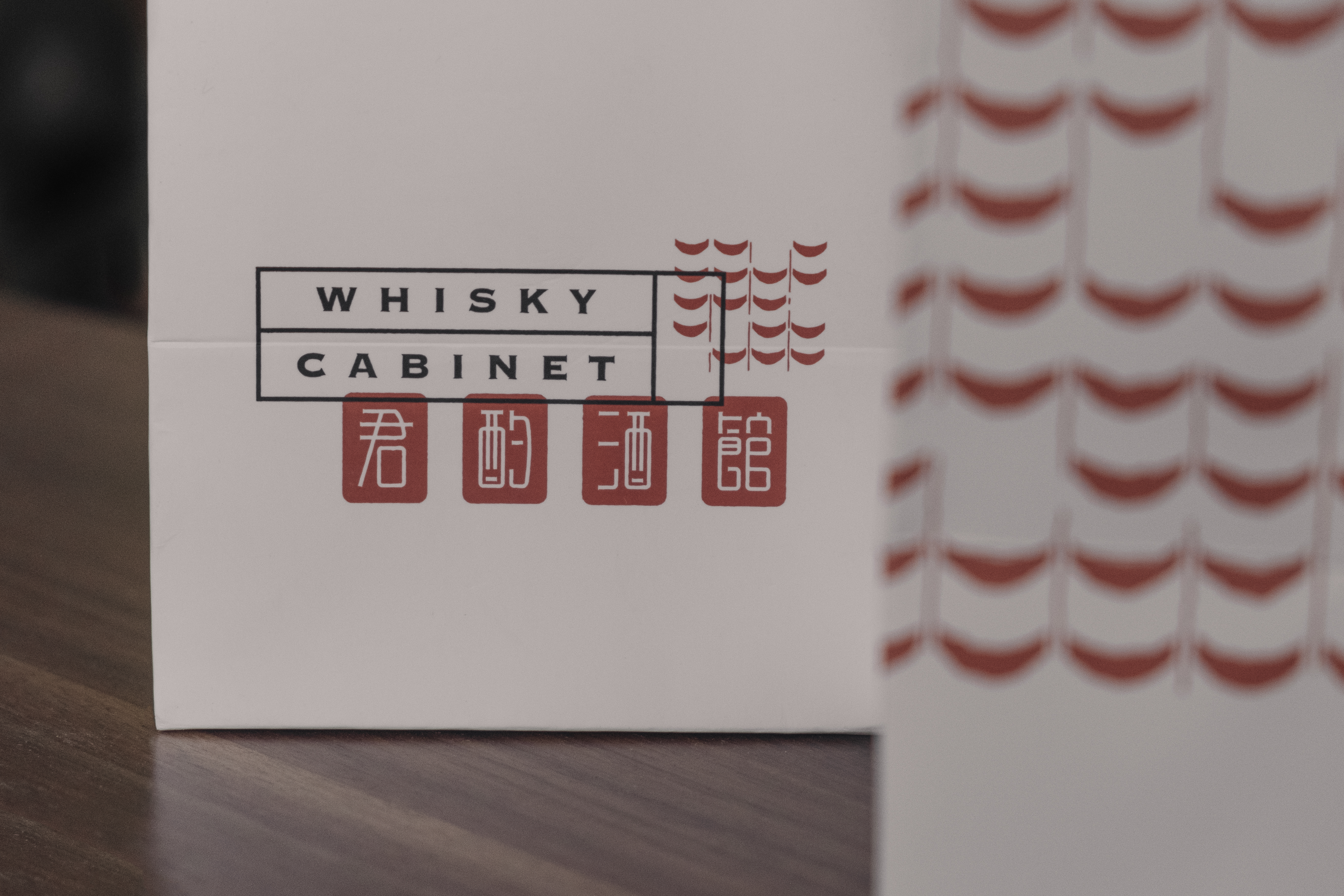


The shop title carries a hidden idea referring the “Cabinet of Curiosities” where wide-ranging collections of extraordinary, rare objects were stored and displayed, it is an ideal metaphor for representing the shop’s comprehensive collection of whisky. On the other hand, Chinese stamp goes way back referring to Chinese poet’s signature, and the poets commonly create a stamp while they were drunk. Convincingly, the western curiosity and eastern romanticism wove into a perfect abstraction of a whisky retail shop.
The concept of the graphic language is based on the engraved stamps and wax seal stamps of both chinese and western cultures, it is also intentional to construct an identity where these two cultures meet. Hence, the logo is designed with a more classic english typeface framed with conventional rectangles, alongside a chinese typeface with smoother strokes. The last graphic element is depicting the historical chinese house tiles, likewise an echo to an essence from the interior design, which is conjointly a major supplementary graphics for all the applications. These three elements deliberately overlapped to each other, showcase the similarity of stamps and stencils easily go on other prints.
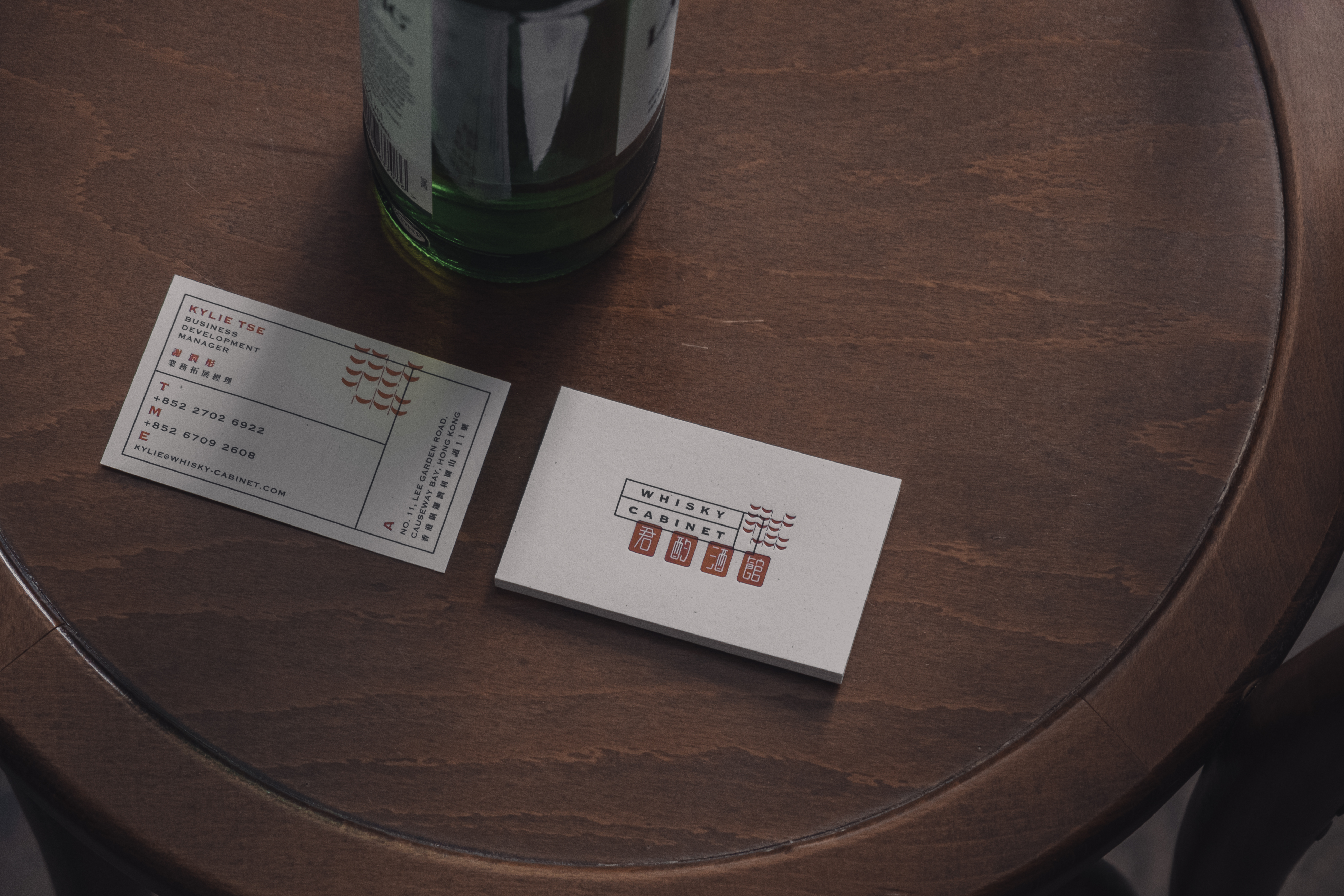
One of the key application is stationary including business card and a document template. PNO designed a document template works as a form for staff to complete the tasting note according to individual whisky purchase. The form has two variations assemble with the brand colors: red, black and white; name card is printed on textured, off-white paper with black and red color text and graphics. Moreover, the layout is composed with rectangle frames and the
The concept of the graphic language is based on the engraved stamps and wax seal stamps of both chinese and western cultures, it is also intentional to construct an identity where these two cultures meet. Hence, the logo is designed with a more classic english typeface framed with conventional rectangles, alongside a chinese typeface with smoother strokes. The last graphic element is depicting the historical chinese house tiles, likewise an echo to an essence from the interior design, which is conjointly a major supplementary graphics for all the applications. These three elements deliberately overlapped to each other, showcase the similarity of stamps and stencils easily go on other prints.
One of the key application is stationary including business card and a document template. PNO designed a document template works as a form for staff to complete the tasting note according to individual whisky purchase. The form has two variations assemble with the brand colors: red, black and white; name card is printed on textured, off-white paper with black and red color text and graphics. Moreover, the layout is composed with rectangle frames and the