2016
Identity
unun
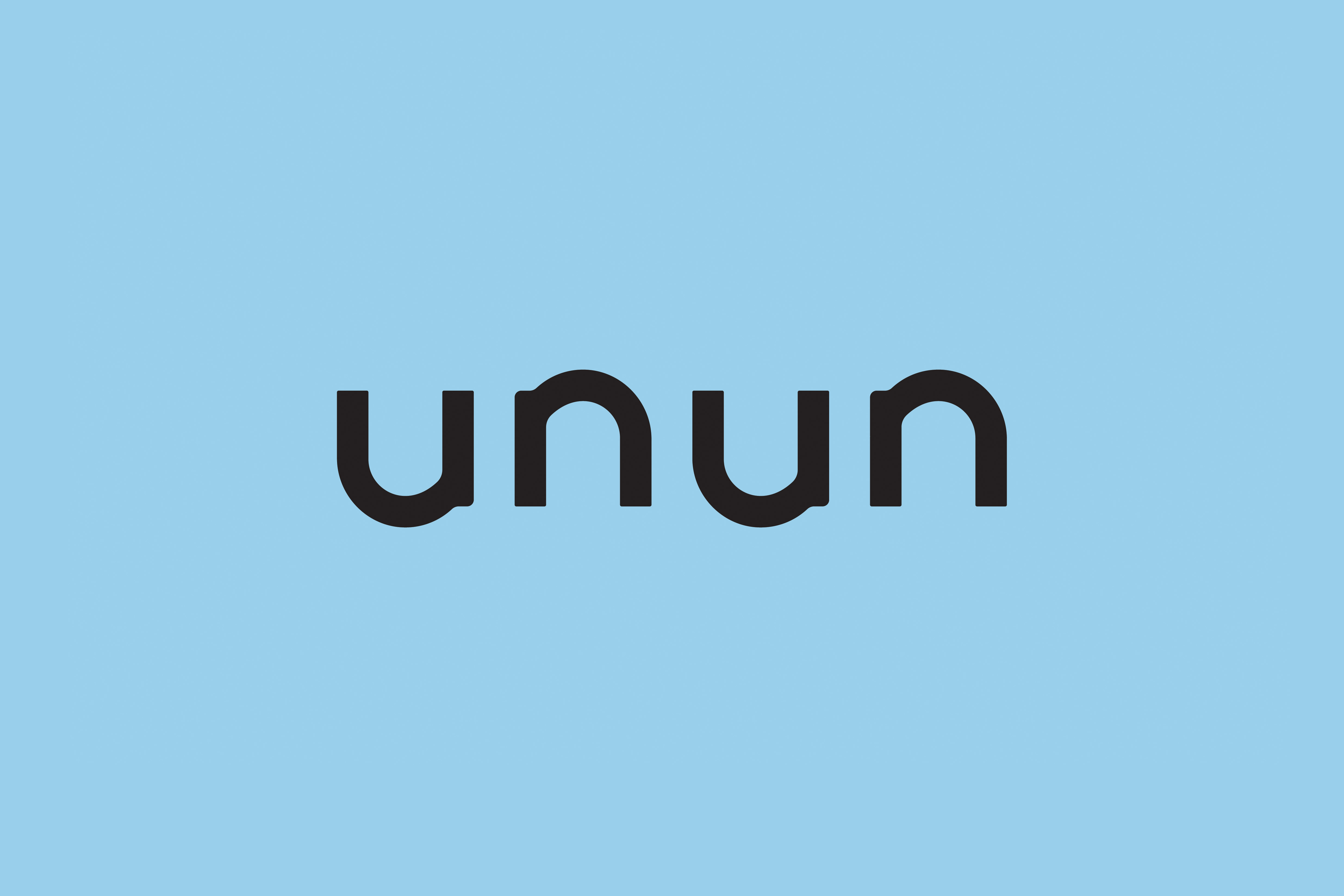


“unun” is a word origin from Iceland represents the expression of ‘joy’ and ‘delightful’, it is a word uses to convey the enjoyment of life. While the word “unun” not necessary speak for any actual meaning, it simply serves as a sound, a vibration or essentially like a magic spell delivering a happy note. The word itself is a combination of sound and specification of the belief. Consequently, the neat curves of an “unun” sound wave further developed into UNUN’s primary logo structure and supporting graphics. The colour scheme is selected to represent the idea of Polar Light, or more like a symbolic meaning of it. By large, PNO aims to conceive a unique branding for unun while it is still able to assimilate into other brands which entitled with similar vision and artistic authentics.
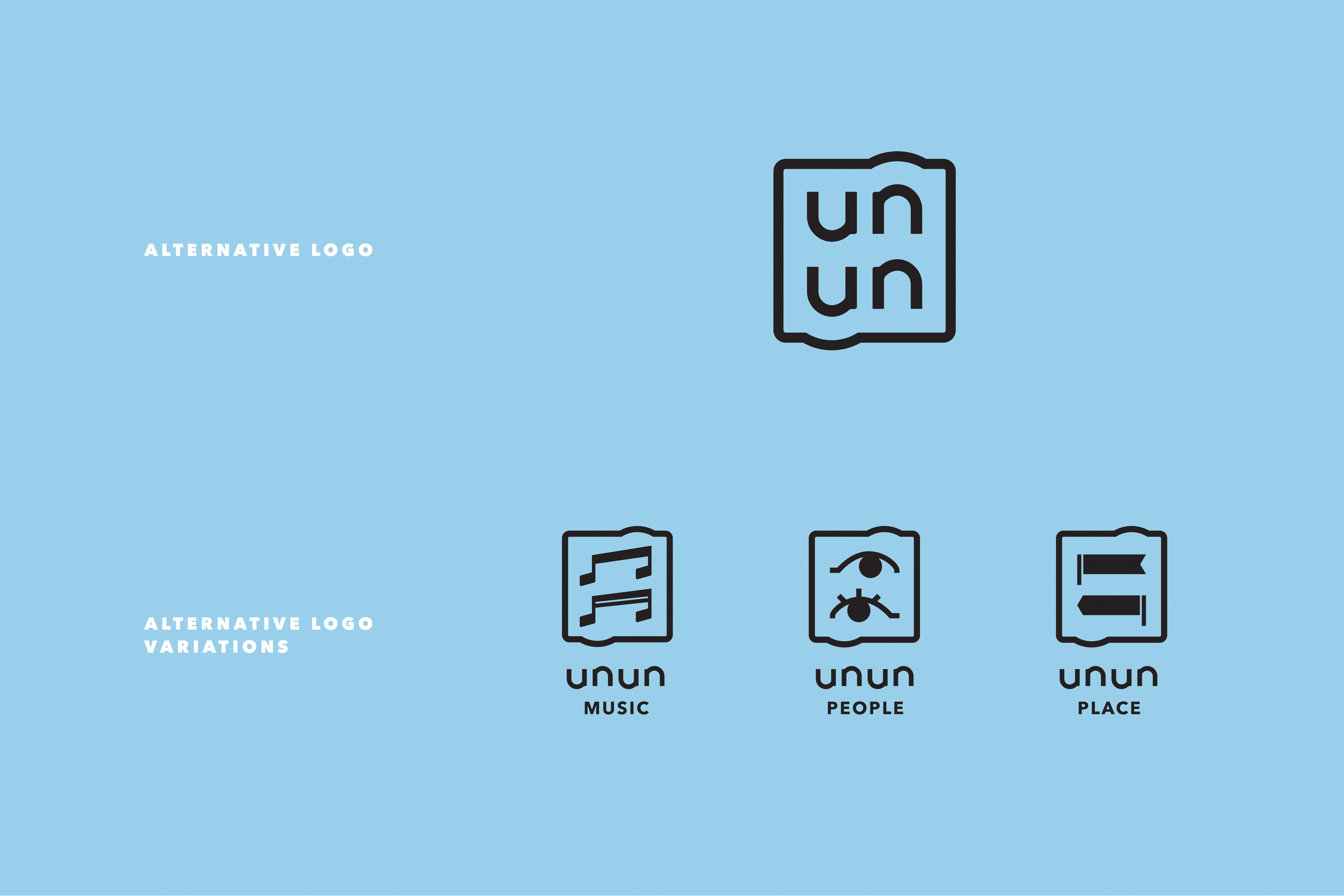
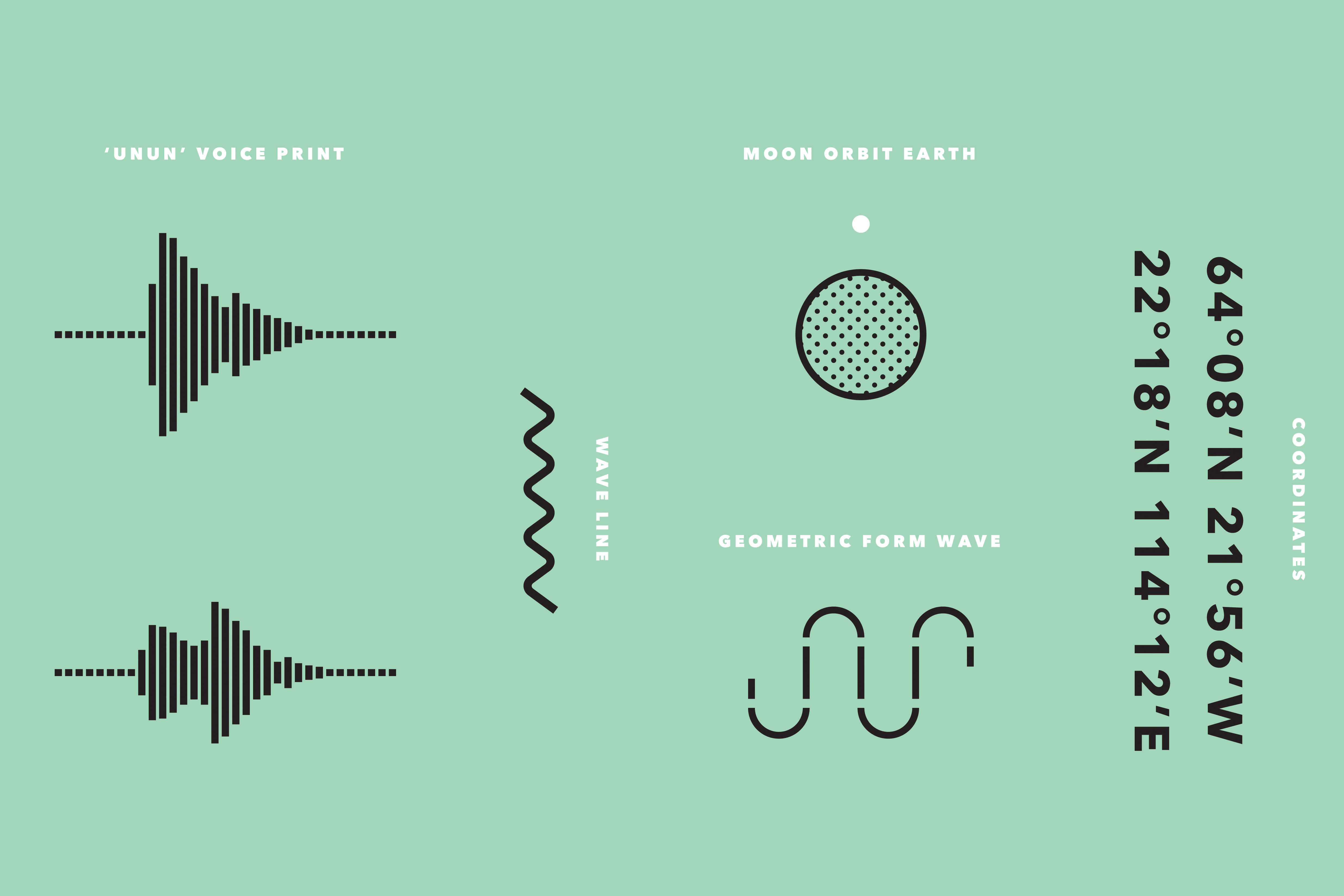
unun, as a brand that merchandise lifestyle goods, it is imperative to establish alternative solution and variations for different usage. Consolidation of both gender’s perspective was one of the primary idea of the alternative solutions, along with the simplicity of the supporting graphics and color scheme, these benefit the identity being more applicable on disparate marketing materials and product categories. The secondary graphics and pattern examples are expanded majorly from recorded sound waves, and the moon lamp which is unun’s most signature and exclusive item. Apart from being minimal, the extensive interpretation of the brand identity is to be bold enough to stand alone, also adequate with other significant art and design brands. Throughout a prudent design process, it is set to be direct, giving a sense of intimacy but not conspicuous.
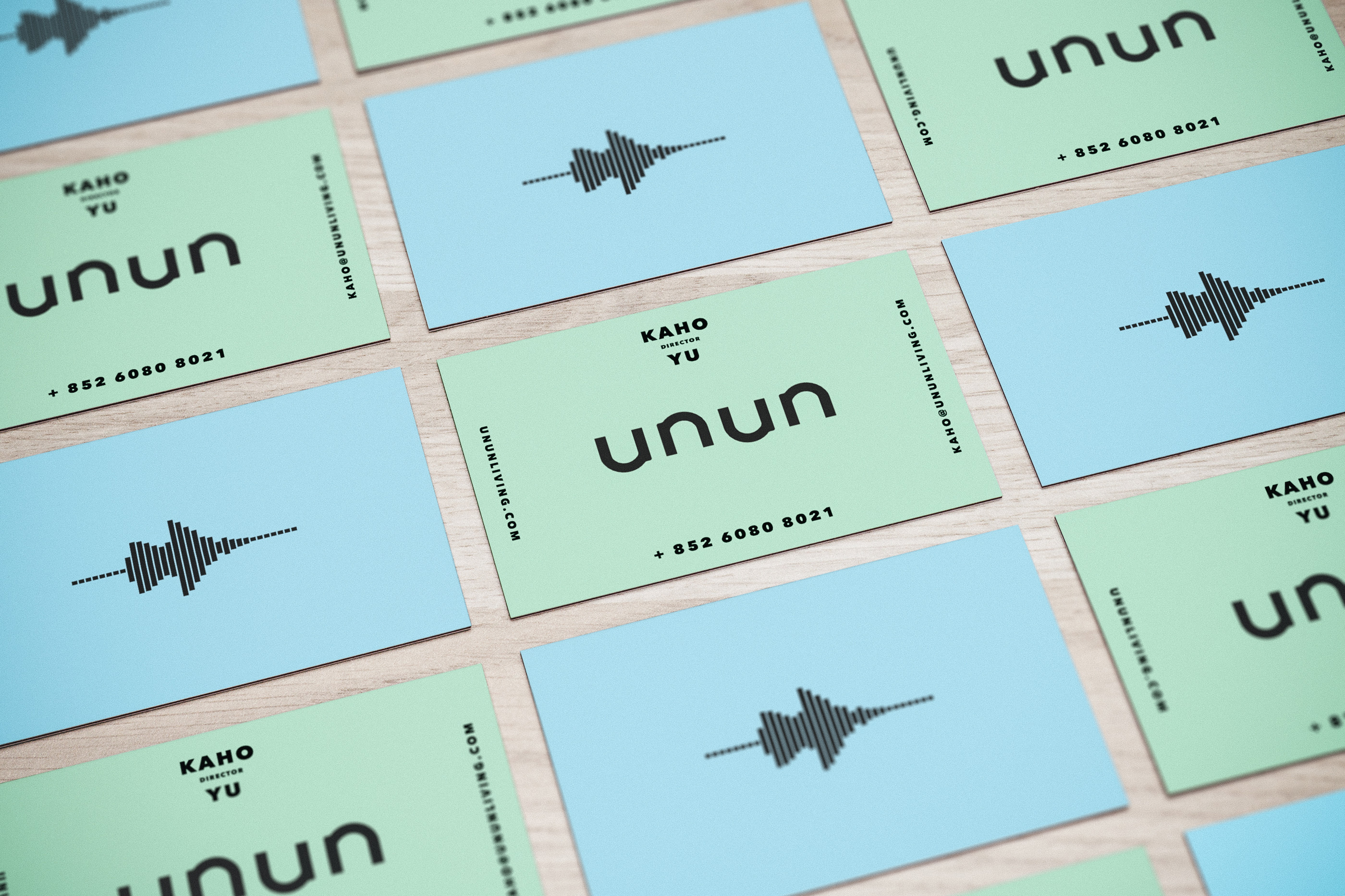
Our team has employed the identity together with compatible art direction style, a series of comprehensive applications such as packaging labels, tote bag prints, name card, campaign design package, english and chinese type fonts.
unun, as a brand that merchandise lifestyle goods, it is imperative to establish alternative solution and variations for different usage. Consolidation of both gender’s perspective was one of the primary idea of the alternative solutions, along with the simplicity of the supporting graphics and color scheme, these benefit the identity being more applicable on disparate marketing materials and product categories. The secondary graphics and pattern examples are expanded majorly from recorded sound waves, and the moon lamp which is unun’s most signature and exclusive item. Apart from being minimal, the extensive interpretation of the brand identity is to be bold enough to stand alone, also adequate with other significant art and design brands. Throughout a prudent design process, it is set to be direct, giving a sense of intimacy but not conspicuous.
Our team has employed the identity together with compatible art direction style, a series of comprehensive applications such as packaging labels, tote bag prints, name card, campaign design package, english and chinese type fonts.